Tuesday, December 29, 2009

Time Out

"Willow Study"
Oil on Panel
8x10"


Sorry I've been MIA for the past couple of months. I tend to blog in my free time, and there just isn't much free time when I'm trying to meet all of the needs of a three year old and an infant and keep up with painting! I also apologize to those of you who have emailed me who I haven't had time to respond to. I love hearing from people and I feel badly when I don't reply quickly - hopefully I'll get caught up in the next couple of months.

Luckily, Owen is in that nice not-yet-mobile-sleep-half-the-day-away phase right now, so I have been painting. I had sort of planned to take an informal three month leave from painting so I could just enjoy the baby phase, but a few weeks after he was born I was all excited about painting again so I got the studio all organized and got back to it. Given a choice between cleaning house or painting while the baby sleeps, I think I'd choose painting anyday.

I've been busy getting caught up on my mailing list and financials, which I've totally neglected for months, and I'm working on some goals for 2010. Mostly though, I'm just trying to do some good paintings when I have the time, and experimenting with some new techniques and ideas.

Most artists will tell you that you should paint everyday, or as much as possible, so you don't get rusty. I agree with this for the most part, but I've also noticed that my art tends to grow when I take time off for big life events. When I had Aspen, and now having Owen, the time I took off gave me more appreciation for my art, but also a different sensitivity for things when I returned, and my style shifted a bit accordingly. I don't know how to explain it, but it makes returning to the studio more fun.

Anyhow, hopefully I'll be posting more regularly in the new year. In the meantime, this is a tiny little painting I did a few weeks ago. It's just a color study, and I was also working on edges a bit since I tend to keep everything a bit too sharp sometimes. I'd love to make this into a bigger painting - I love the contrast between the hot sunlight hitting the willows, and the coldness of the snowy landscape.

Tuesday, November 03, 2009

He's Here!


Just wanted to announce that our little boy finally decided to make his grand appearance! His name is Owen Matthew and he was born on October 26th at 5:09 pm, and weighed in at 7 lb 13 oz. I'd been staying at my parents house that weekend, since I was so close to my due date and we live so far from the hospital. Nate managed to get down the mountain just in time to get me to the hospital with a couple of hours to spare. We're all happy and healthy - I'm just resting and recovering and adjusting to a new routine with two kiddos.

I'm sure I'll be taking it easy on the art (and blogging) front for a few months, but I'm already itching to hit the studio. We'll see if I can squeeze in a few hours of painting sometime in the next few weeks!

Wednesday, October 14, 2009

Balance, or the Lack Thereof

"Gothic Road Aspens"
Oil on Panel
18x24"
2009

Being an artist and a mom takes a lot of focus on keeping things organized and balanced - on a good day I struggle to get things done, but I seem to have completely lost my balance lately.

I'm due to have this little guy any day now, and the waiting game is about to drive me insane. I'm ready to have a cute little baby to snuggle and take care of, and to have my body back and start moving forward with my family and my career. Not knowing what day he's going to make his grand appearance is making me crazy, and I'm just trying to keep myself busy so I won't get too impatient.

This has been a tough year. I've struggled to keep up with the art side of things -between 20 weeks of morning (ALL DAY) sickness and a handful of minor complications that kept me heading down to Denver for doctor's appointments, I've just been trying to keep my head above the water and keep the few commitments I had made earlier in the year. I missed deadlines for a bunch of juried shows, declined participating in some other invitational type events, and haven't been providing all of my galleries with new work like I should. I managed to prepare for my two person show in August and keep up with demands for work from galleries that were selling well, and that's about it.

It's easy to beat myself up about what I missed this year, and worry about whether it sets me back, but I keep reminding myself that it's just a season, and that I have to stick to my priorities. Fact is, this is probably the last kid I'll have, and I want to spend some time enjoying him as a baby just as much as I want to make sure I don't miss a thing about Aspen as she grows up. My priority this year has been my kids, and as tough as it is to swallow, I know my art will be waiting for me when I get back to a point where I feel well enough and have enough time to really focus on painting again. In the meantime, I'm doing the best that I can, and trying to enjoy the process along the way. It's not easy, but at least it's always rewarding!

Monday, September 14, 2009

Weekend with the Masters

When I heard about Weekend with the Masters a few months ago, I was pretty excited that so many fantastic artists were going to be teaching in Colorado this year. I was all excited about signing up for the whole thing until I realized I might not be totally up to it while eight months pregnant - kind of a bummer. Anyhow, I ended up registering for a few of the individual weekend events that didn't involve hauling painting equipment out into the wild. We headed down to Colorado Springs on Saturday and hung out at a hotel with Aspen (fun - elevator and pool! what more could a 3 year old ask for?!?!), and then I attended a couple of sessions on Sunday.

I have to say, after looking at everyone's pictures on Facebook and attending a couple of classes myself, I'm pretty envious of those who got to attend the whole event! It was really well organized, and the group of instructors was top notch.

On Sunday morning I attended Scott Burdick's lecture on using photographic references for painting. For those not familiar with Burdick's work (www.scottburdick.com), he paints fantastic figuratives of people he encounters on travels throughout the world. His work are lush and full of life, so I was curious to hear more about his process and his view on using photos to work from.

The lecture didn't disappoint. Scott showed hundreds of slides of his work, as well as some of the photos he worked from for particular paintings. He stressed the importance of working from life on a regular basis to gain the experience needed to allow you to provide info that a photograph can't, but also stressed the importance of using photos to paint certain types of subject matter or locations. Here's a snapshot of a plein air painting he used to illustrate the color subtleties that a camera can't capture:


The thing that struck me viewing the slideshow was how luminous and energetic Scott's paintings were compared to the actual photos he painted from. He takes very good reference photos, but when he paints he takes the reference further and injects life and emotion that the photos lack. I work from a combination of photos and studies, so seeing his slides gave me something to strive for - if I can't be improving on the photo in my painting, I shouldn't be painting it!

In the afternoon, I attended a critique session with Kevin MacPherson. There were about 25 artists at the critique, and we had all provided one or two digital images of our work for Kevin to review prior to the session. Kevin had spent a lot of time preparing comments for each person's work, and interspersing images of our work with examples of masterworks that showed what he was trying to say. It was really valuable to hear the critiques of everyone's paintings as well as my own, and Kevin has a great sense of humor that kept us all entertained through it all.

The first painting I submitted was one of my personal favorites. I had entered this painting in a couple of juried shows and been rejected, and wanted to know what was up.


Kevin's critique of the painting was mainly that it had too many hard edges all over. There are also some issues with repetitiveness in the pine trees on top of the cliff, and competition between the two front cliff faces for attention (he suggested possibly darkening the cliffs in the middle ground to make the front cliffs more important). Overall though, it was all EDGES EDGES EDGES.

Looking at the painting, I totally agree. I think it's taken me a while to get to a point where I could absorb this critique. A year ago, I might have fought similar comments, thinking that the hard edges are a part of my "style". Over the past few months, I've changed my thinking and have been starting to incorporate more variety into my edges and brushwork, so I was in a good place to hear this critique.

The other I submitted was a larger painting of aspens that I did earlier this year for the Colorado Governor's Invitational show. I was proud of this painting and it has received a lot of compliments, but there were some things about the foliage that had been bugging me, and I could never put a finger on exactly what my issue was.


Kevin liked the painting but got down the main issue right away - the foliage of the aspens on the right was mimicking the hillside angle, and the cloud on the left was mimicking the shape of the aspen foliage. It was like an aha moment to me - I'd been so stressed about getting the colors and foreground of this painting right that I didn't even notice the issues with repetitive shapes up top! He also pointed out that he liked the lost and found edges in the aspen on the far left, and suggested that I incorporate some of that into the rest of the painting (again - EDGES EDGES EDGES).

Overall, I came out of the critique with an understanding of some of the bigger things I need to be working on, and it gave me a little bit of a kick in the pants to continue to work on improving my work.

Now that I've been all inspired, I just need to find some quality time to paint before this little one makes his grand entrance in about a month!

Studios Magazine


Just wanted to share with you all that American Artist Magazine's special issue on Studios is out now! You can pick it up at a bookstore or order it online here.

There's a little blurb inside about my studio (well, my studio in our last house), but more importantly there are articles about a ton of other artists' studios and the many ways different artists have adapted to their spaces. It's a must read if you're looking for ideas for your space.

Wednesday, September 02, 2009

Overwhelmed

"Gore Range Sunrise"
Oil on Panel
16x20"
2009

Wow, I'm surprised I even remembered my blogger login - it's been awhile!

We've been moving into our new house and I've been preparing for a show, and on top of that I've been busy chasing a toddler and trying to survive my third trimester of pregnancy. It's been a bit chaotic and I'm a bit tired, to say the least. Now I have a cold - ugh...

We had to move out of our other house before we had the official certificate of occupancy on this house, so we moved all of our stuff to the new house, but have been sleeping at my in-laws house for a week. It's all been a bit transitional and I've been looking forward to having a home again. I'm slowly making progress on the unpacking, and tonight we're finally sleeping in the new house, so maybe there's a light at the end of the tunnel?

I took a couple of pictures to document the chaos. This is what it looks like when your husband takes away half of the living room furniture while you're in the middle of framing for a show. I figured I might as well take over with my paintings since the couch wasn't taking up the space anymore:


This following picture is my defense for why I drive a gas-guzzling SUV (well, other than the fact that I actually live somewhere where it's necessary to have four wheel drive a good 6 months of the year). This is my car all packed up with 17 paintings for my show. When it comes time to deliver paintings, I'm always thankful I can fit a 30x40 framed painting in the back of the car with ease. Heck, I could have fit twice as many in there!


Anyhow, that's all I've got for now. Electrical went in up in my studio last week, so stay tuned for some in-progress shots as construction finishes up in there. Right now my easel is taking up half of the soon-to-be-nursery, so I've given my husband a deadline for finishing the studio.

Okay, time to go get some sleep now (yay!).

Thursday, July 30, 2009

Pricing for Geeks

"Wildflowers"
Oil on Panel
12x16"
2009

Tony Moffit had an interesting post last week about an artist who had priced their work per square inch, and had a gallery lower the price of their larger works. Tony correctly stated that the gallery had no right to force the artist to change the price of their work, but I disagreed with his statement that pricing by the square inch is correct. Since then, Clint Watson posted his own opinion on the Fine Art Views blog, and sparked a great discussion in the comments about pricing practices. If you haven't read either post, read both - they're great!

Pricing can be difficult for an artist, especially when starting out. It's easy to see the appeal of pricing work on a simply per square inch basis, but it results in very cheap small paintings and very expensive large paintings.

When I got accepted into my first gallery, they set my prices at something like $3/sq. in. I made next to nothing on my smaller pieces, but my larger work was at a good price point for an emerging artist at the time. My paintings started to sell faster than I could keep up (those were the days!), and the gallery and I quickly figured out that it was time for an adjustment. At the time, we increased my larger pieces by 10% and the smaller ones by up to 50% - in the end, my small paintings were priced much higher on a per square inch basis than my larger paintings, and they've stayed that way since. I keep track of this graphically because it helps me make sure that none of my prices are out of line. Here's what my pricing looks like for a wide range of sizes:


You can see that I range from about $9/sq. in. for a 6x8" painting, down to about $4/sq. in. for a 36x48" painting - not a small difference!

Nowadays, I set my own pricing, and adjust my prices when I feel a need based on demand. In the past, I've raised my prices 10-15% at the start of each year when I felt that I was having a hard time keeping up with my galleries, with an occasional bump in prices when I won awards or got magazine coverage. This year, I didn't raise my prices because I didn't feel that the current market warranted it, and I stand by that decision for now.

One thing I do to make sure my prices aren't unreasonable is to compare with a selection of other artists with similar resumes. I pick a handful of artists in this region who paint similar subject matter, show in the same tier of galleries, and have been in some of the same shows as I have, and I record their prices for a range of sizes. I put them all on a graph together just to make sure my prices are following the same trend, and aren't too far off in magnitude. Here's my graph for the last time I did this:


You can see that my prices tend to be on the low side compared with this group (I'm the bottom line), and I'm comfortable with that. A lot of my peers raised prices this year, so I'm left looking a bit cheaper than I used to be. My paintings are still selling well, so chances are I'll raise my prices a bit at the start of next year. In a market like we have now, I'm okay with being patient and just trying to do good work.

Tuesday, July 14, 2009

My Favorite Things - Web Edition

"October on the Colorado"
Oil on Panel
30x40"
2009

A while back I posted about the materials I prefer to use in the studio, but didn't touch on any of the other things out there that are indispensable to me as an artist. I was just thinking the other day about how thankful I am for some of the online tools and stores that I use to make my job easier, and thought I would share some of my favorites. Oh, and for the record, I'm not getting paid to share any of this - I just love these companies so much I wanted to pass them on!

1) FineArtStudioOnline.com (or FASO) - www.fineartstudioonline.com

I don't even know where to start - FASO is the company I use for my website, and I can't even begin to describe how simple it has made the web component of my business. I signed up for my FASO website in 2006 and haven't looked back. The FASO software makes it easy for even non-computer geeks to put together a professional looking website that's easy to update.

As an artist, I think keeping one's website updated with new work and events is of the utmost importance, and FASO allows me to update my website in minutes. I can't even fathom what a pain it would be to deal with a web designer to make all the updates I make on a regular basis.

On top of that, the service includes email, blog capability, an email newsletter system, and statistics. I couldn't ask for more, and Clint and his customer support staff have always responded to every question of mine promptly. If you're frustrated with keeping your website updated, or just getting started, I can't recommend FASO enough.

2) Constant Contact - www.constantcontact.com

I just signed up for this newsletter service recently, and I honestly wish I had done it months ago. Constant Contact makes it easy to send out a very professional email newsletters and announcements, and keep track of your mailing list. I finally got around to sending out my first email newsletter yesterday, and I'm astounded at the response I've gotten. People have been impressed at how professional the newsletter looked, and I've had people click through to my website that had probably forgotten my work existed.

The most useful feature for me is the reports - after 24 hours, I can look and see what % of my recipients have opened the newsletter, I can see how many have clicked through to the web links I included in the text of the letter, and I can see how many bounced back to me (one) or opted to be removed from my mailing list (none). That sort of input is valuable in figuring out what should be included in the newsletter month to month, and how people are responding.

I can also easily decide which people get which types of content - for instance, I may send acquaintances event announcements, but not notifications of new work - Constant Contact makes it easy to make sure the right people get the right info.

I procrastinated about paying for a service like this for a long time, but at this point I think it's definitely worth the small monthly fee.

3) Dick Blick Art Supplies - www.dickblick.com

I live in the sticks, so I can't just run out and buy art supplies at the store on the corner. I order pretty much everything I use online, and at this point I buy everything but my paint from Blick. Their website is easy to use and organized, their customer service is fantastic, and they pack things so well that I've never had an item show up damaged (this can be a big deal when you paint on hardboard panels like I do - a lot of places don't pack them well and they show up with cracked corners!). And the icing on the cake is that their prices consistently beat out most other online retailers for the items I buy.

4) Utrecht Art Supplies - www.utrecht.com

I have to give shout out to Utrecht simply because their oil paint rocks. It's high quality artist grade paint that comes in big tubes at prices that beat most of the other paint manufacturers. It's the perfect consistency for me (I find other brands either too oily or too stiff), and the pigment load is great. I haven't been disappointed yet by the quality of this stuff.

5) Bloglines - www.bloglines.com

I read a LOT of blogs. There's no way I can keep track of them all, so a feed reader is a must if I'm going save my sanity and a lot of my time. I know a lot of people use Google Reader - same thing, essentially. I assume most people who read this blog probably use a reader of some type - if you don't, you need to because it will make your life much easier!!

Anyhow, that's all I can thing of right now. Anyone out there have any can't live without sites?

Thursday, July 09, 2009

Shameless Self Promotion


I just wanted to pass on a link to a new article about my art that's just out in the current issue of a local magazine. One of my paintings is on the cover - you can read the article text here (or pick up a copy if you're in the Winter Park/Grand Lake area).

It's kind of weird to walk into the grocery store and restaurants everywhere in town and see my own painting staring back at me from the magazine stands!

Sunday, July 05, 2009

Weaknesses

"Study, Afternoon Sparkle"
Oil on Panel
9x12"
2009


One of my big painting goals last year was quantity - I wanted to paint 100 paintings in 2008 to make sure I was putting in sufficient brush mileage to improve. This year I decided to go for quality, and I've been working on larger pieces and taking my time trying to get things right.

One thing I've noticed over the past few months is that I really don't like to work small. Pretty much anything smaller than 16x20" gives me fits, and paintings in the 24x30" to 30x40" range have been feeling the most comfortable for me. I think the reason is that the bigger panels allow me more room to play with brushwork and color within the main shapes of the painting. I've found myself really struggling to abbreviate things well enough in the smaller sizes.

At first I just figured I'd go with my gut and work on larger stuff. Then I found myself getting requests from galleries for smaller work, and ended up struggling through a bunch of smaller pieces anyhow, fighting the process all the way and telling myself I'd give up the small stuff when the economy improved. But this past week I realized I was giving up a bit, and decided to change my attitude.

I already limit my subject matter by painting landscapes, so why limit myself further by saying I prefer to work in a certain size range? I decided maybe I shouldn't be imposing more limitations on myself, and that maybe I should rise to the challenge and figure out what it is about working small that bugs me. I think it's a lack of control - in an 8x10" painting, each brushstroke and color has to be in the correct spot or things get sloppy, and I have a hard time controlling things well enough. Turns out my distaste for the small stuff is highlighting a big weakness.

So, I'm going to approach the small stuff with a better attitude, and see how I can improve my brush control and drawing by working on smaller studies. Hopefully I can get it right, and learn something along the way.

Do you impose limitations on your work to ultimately hide or ignore your weaknesses? I think it do it more often than I know!

Saturday, June 20, 2009

A Couple of Favorite Quotes

"Fall Grove"
Oil on Panel
30x40"
2009

Well, for a while there I was bad about posting because I was sick and not painting and had nothing to say. Now I'm feeling better, but I haven't been posting because I've been swamped meeting deadlines after two months of getting nothing done! If it's not one thing, it's another I suppose.

Anyhow, I just wanted to pass along a couple of quotes by William Wendt that I wrote down when I was reading through the catalog for last year's show at the Laguna Museum. Wendt is one of my favorite landscape painters, and I would have loved to see the show. Alas, I have to be happy with the catalog, which, luckily, is fantastic.

"Nature had more to say than can be caught in a minute, she has lessons for us that may take a lifetime in the learning and I believe she intended that we landscape painters should mix brains with our paint."

I love how he speaks of landscape painting as a lifetime endeavor, and dismisses the idea that it isn't intellectual. I also love this one, which explains so well why I love wilderness and landscape painting:

"Here, the heart of man becomes impressionable. Here, away from conflicting creeds and sects, away from the soul-destroying hurly-burly of life, it feels that the world is beautiful, that man is his brother, that God is good."

Sunday, June 14, 2009

Photographing Oil Paintings

Photography ranks near the top of the list of things I don't like about my job. Getting good photographs of my paintings has frustrated me since the day I started painting. Unfortunately, the further I get in my career, the more important it is to have quality images of my paintings.

I used to have a perfect spot in my house to photograph my paintings - indirect light, no glare, just perfect. Then we moved (three times), and every time we moved I found myself scrambling to find a new "perfect" spot.

I've tried every spot in the current house with indirect light, shooting outside on a cloudy day, shooting outside on a sunny day, shooting inside the studio with my daylight flourescents, shooting my paintings at an angle, and whatever else you might suggest. No matter what, I seem to end up with glare on some part of the painting. I use thick paint, and I find it next to impossible to to take a photo without the light catching on some brushstroke, and it drives me insane. For big paintings, it's not a big deal - hardly noticeable unless you blow up the painting full size. For small paintings, or paintings with a lot of dark values, it can make getting a decent image virtually impossible.

So, I started looking into having my paintings professionally photographed last year. Problem is, most photographers who know anything about photographing 2D art charge $50-$70 per painting, which adds up quickly if you're at all prolific. Also, I live in the mountains, so add in the hassle of transporting my paintings two hours to a photographer in Denver, then having to make the same trip to pick them up. I'm cheap, so this doesn't really appeal to me - I'll probably only do this if I ever start to make giclees or prints.

A few weeks ago, Carole Marine recommended this new ebook called "Exposing Yourself: The Artist's Guide to Digital Imaging". It's written by Jason Smith, a photographer who does all the photography for the Greenhouse Gallery in San Antonio, TX (if you want to see his work, just go click on the high res image of any painting on their website). Every year I'm impressed with the images of my paintings that show up on the Greenhouse Gallery website for the Salon International show, so I figured I could probably learn a thing or two from him and bought the book.

The book covers everything from cameras to lighting to computer editing and printing, but I was mostly focused on the lighting. Like most of the local photographers I've talked to, Smith recommends using polarizing filters on the lights and camera to eliminate glare. Unlike most of the photographers I've talked to, he actually explains how to do this in enough detail that I was able to order the equipment and try it myself!

So, long story short, it worked. I'm actually totally impressed at how easy this was after all my frustration over the past few years. The picture I put up with my last blog post is the poster child for all of my frustration.

Here's the "before" shot:


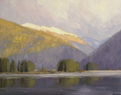
If you click to enlarge it, you can see that I had some serious glare on anything resembling a vertical brushstroke. It looks okay small, but full size it's fairly atrocious. And since it's a small painting (11x14"), it's really obvious that the photo is lacking.

Here's my "after" shot (click to enlarge):


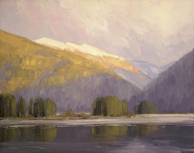
You probably have to see these images full-screen to really see the difference. First of all, NO glare - yay!! Second of all, more saturated color and accurate values. I took this photo and uploaded it to my computer and immediately felt that every penny I had spent on lighting and filters had been worth it (and wished I had figured this out two years ago).

Also, for the record, the "before" photo took me about half an hour and twenty photos to get the quality you see here. The "after" photo was my first shot after setting up the new lights - that's about 29 minutes worth of frustration avoided! This is just an average example, but I've had some paintings with darker values that were a nightmare to photograph without having glare messing up the values, and I can tell just from this photo that this setup will solve those problems completely.

Overall, I had to spend about $270 on equipment. I bought a polarizing lens for my camera, an adapter for the lens since my camera isn't an SLR, lights, bulbs, stands, polarizing filters for the lights, and filter holders for the lights. That cost translates to the price of having about five paintings professionally photographed, so I figure it'll pay for itself quickly. Also, now that I know I can successfully eliminate the glare myself, I'll feel more justified in eventually buying that nice new DSLR that I've had my eye on for a while!

Anyhow, I just wanted to share this, and say that if you have any questions about photographing your paintings or editing the digital files, I'd highly recommend getting Smith's book, Exposing Yourself. It's a simple upload, and worth every penny at only $19.95.

Now, if you'll excuse me, I'm going to go re-photograph every painting in my studio!

Thursday, May 28, 2009

Working Hard or Hardly Working?

"Last Light, Monarch Lake"
Oil on Panel
11x14"
2009

My fortune at the Chinese restaurant last night said, "Chance favors those in motion." I read it to my husband and we both laughed - after all, I've spent the last few months trying to move as little as possible!

Isn't this common sense, though? I think of it as "making luck" - making the effort required to position ourselves where we can take advantage of new opportunities. I'm painfully aware that when I'm not working, I'm not in a position to go anywhere with my art but down. The more effort I put into making and selling my paintings, the more likely I am to get results. Being an artist is not an easy job - it requires commitment and elbow grease.

Alyson Stanfield touched on this in her Deep Thought Thursday blog last week, asking her readers how many hours per week an artist should devote to his or her career, referencing Michael Shane Neal's suggestion of 12-18 hour days.

I usually love reading the responses to Alyson's Thursday questions, and this one was no different - the answer was obviously that there is no answer and that it depends on the artist. I think most agreed, however, that the more time you can put in given your circumstances, the better. But there was one post that implied that anyone who thinks of their art making in terms of time is not an artist, and it got my blood boiling a bit. I might have even fired off a hasty response without taking the time to cool down - hehe...

Suffice it to say, I totally disagree. First of all, it's downright insulting to say someone else is not an "artist" simply because of their working habits. We could argue all day about what is "art" and what is not, but I daresay it has very little to do with whether the artist works 9-5 or in the dead of the night. Second of all, I think this type of attitude can be very dangerous to those who wish to start a career in the arts. There's a misconception that being an artist is fun and relaxing, and the minute things get tough a lot of young artists run for another career.

I know a lot of artists in real life, and they all have different work habits. Some are very regimented and schedule every hour of every day to optimize their art making time. Some are more laid back and work different hours every day, depending on what else is going on. But regardless of style, every artist I know who actually makes a living from their art (meaning does art full time and makes enough money to support themself and often their family) works damn hard. A lot of these guys paint more than 40 hours a week, and then spend 20 hours more working on business and networking. They take their art careers as seriously as anyone else who runs a small business, and it shows.

I have yet to meet an artist who got worse by putting in more hours. Have you?

Tuesday, May 19, 2009

More Progress

I'm 17 weeks pregnant tomorrow, and I'm torn between thinking this morning (all day) sickness is going to go away any day now, and being resigned to the fact that it might stick around for 23 more weeks.

I'm terrified that the latter is the case, to be completely honest. I have a new gallery to supply with paintings and a show to prepare for in August, and while I have a head start on both, I'm still panicked about how I'm going to get things done. I'm at a place where I'm determined to squeeze in easel time where I can, even if it means only painting for an hour or two at a time.

So, anyhow, I felt like crud today but managed to get a couple of hours of painting in, and got the rest of this 16x20" painting blocked in. I'm not expecting a masterpiece here - just trying to get back in the groove with a paintbrush!


It needs some work, especially in the foreground trees and bushes, but it's a covered panel and that's great compared to the nothing that I've been doing! Sorry for the glare - I was having fits trying to get a decent photo of this one since it's still wet. Once I finish it and get a better photo, I'll re-post it.

So, baby steps - I'm hoping 2 hours can turn into 4 hours next time and a full day eventually. I don't feel like myself when I'm not painting, and that's motivation enough to get to work.

Thursday, May 14, 2009

Progress, Finally

It's been an unproductive two months, to say the least. I've had all day "morning" sickness since the start of March, and it's put a big kink in my painting schedule. Standing at the easel just isn't all that fun when you're dry-heaving, you know?

To be completely honest, it's been a bit of struggle for me to accomplish next to nothing day after day - I've spent more than a few days feeling sorry for myself, which I know is totally useless. I've had a couple of good days over the past week, so I'm really hoping that means I'll start feeling better soon. In the meantime I'm just going to force myself to do as much as I can.

So, I painted today for the first time in weeks. I only lasted three hours at the easel before I had to take a rest, but I got about halfway into a 16x20" painting, and I felt like myself for the first time in ages. It was just so nice to finally PAINT!!

To prove to y'all that I finally did something, here's my in-progress picture (color is way off - sorry). It's got a long way to go because I'm a bit rusty, but I don't care because it was just so nice to finally work on something new.


On a totally unrelated note, I found a bottle of liquin in my studio that I hadn't touched in a couple of months, and was kind of appalled at how nasty it was. I took a picture just to show you all why I try not to use this stuff much in my paintings. See that cloudy yellow congealed nastiness inside? How would that look if it were mixed in with light paint in a painting? Ick. (p.s. Not trying to knock anyone who uses liquin normally - I'm just always surprised at the things this stuff does in the bottle!).


Anyhow, that's all I've got for now. If all goes well, I'll post some more pictures of this painting as I work on it next week.

Wednesday, May 13, 2009

Pegged

"Summer Grove"
Oil on Panel
30x24"
2009

I've painted a lot of aspen trees this year. It started out as a challenge - I struggled with them, and since they're everywhere in Colorado I figured I should work on it. And they're fun to paint - every grove is different. Also, the galleries love aspen paintings, because tourists buy them, and I can't complain when they're paying my bills during a rough patch in the economy. But this is the point where I get a little bit wary of being pegged as a painter of very specific subject matter.

Do I want all of my galleries to be begging for aspen paintings for the rest of my life? Probably not. I like painting them, but like everything else, only when I feel like it!

The best artists out there sell regardless of what they paint. It doesn't matter if Richard Schmid paints a figure or a landscape - he executes all of his paintings so well that his collectors see value. And since he's painted a variety of subject matter throughout his career, his audience doesn't expect to see only one thing.

I paint purely landscapes, so my subject matter is already a bit limited, but I like painting different scenes, seasons, and moods. I used to paint a lot of big vista mountain paintings, but since I've moved to the mountains, I find myself painting the more intimate scenes - the corners of the landscape that you see when you spend more time in a place. I think that expanding my comfort zone has improved my painting.

It keeps me on my toes to paint different things, so there's a fine line to walk between keeping the galleries happy and painting what will help me grow as an artist. I think this is something a lot of artists face when they sell through galleries, and sometimes the best thing is to find a gallery that is run by owners who truly appreciate good art (vs. "sellable" art). I tend to have the attitude that if I improve enough that anything I paint is a knockout regardless of subject matter, it won't matter what I paint so much as how it's painted. To get to that point, I have my work cut out for me - I won't be getting bored any time soon.

Sunday, May 03, 2009

Another Poll

Hey all - my husband is working with a designer on a new logo for his homebuilding company, and wants some opinions on his current options. I know this has nothing to do with art, but I know you all have good taste, so would you mind taking a look and voting on which one you prefer? Pretty please???

FYI, he builds modular homes in the mountains of Colorado. The logo goes on his marketing materials, advertising, and website, and also on his truck and equipment etc. One of these is his existing logo, and one is the proposed new one (I won't say which is which), and he's not sure he wants to make the change to the new one. If you have any opinions on what could be changed to make either one of them look better, feel free to leave them in the comments.

Sorry these are cropped so tight - use your imagination =)

Here's Logo #1:


Here's Logo #2:


Thanks a bunch. I promise I'll post something about art this week - I have a new painting to show!

Sunday, April 26, 2009

Materials Safety in the Studio

"Sunrise Study"
Oil on Panel
6x8"
2008


I’ve gotten a lot of emails over the past few years about what changes I made in the studio when I was pregnant with Aspen, and I’m getting them again, so I figured I’d put this out there for anyone who might be interested. I’ve got a degree in Chemical Engineering, so I’ve done a lot of research on the chemical properties of oil paints and mediums, and made what I think are some educated decisions about what’s safe and what’s not in the studio during pregnancy. For the record, I don't know everything and I know there will be people who disagree with some of this, so take this all with a grain of salt!

1) Paint

Regular oil paints consist of pigment in a linseed oil base. Linseed oil itself is not a health concern – actually, a lot of people take flaxseed oil (same thing) supplements for their health. The pigments in the paint are another story. The earth pigments are okay (sienna, umber, ochre), but the heavy metals (cadmium) can cause health problems. Luckily, heavy metals such as cadmium are mainly a health concern if inhaled, as they are generally not absorbed by the body by ingestion or absorption through the skin. If you were to ingest cadmium paint, for instance, it is likely that your body would pass it through without actually absorbing the form of cadmium that is used in the paint. For the most part, the paint itself is safe; however, I do take the precaution of wearing gloves at all times when I’m painting, to prevent the chance of anything absorbing through my skin. I also don’t have food or drink in my studio, just as an extra precaution.

A lot of people have suggested that I use walnut oil paints, water-soluble paints, or acrylics to cut down on health concerns. Just to clear things up, walnut oil paints are the exact same thing as regular oil paints, only with walnut oil substituted for the linseed, so this doesn’t provide any health advantage on its own. Water soluble oil paints scare me because I don’t know enough about what chemicals they put in them to make them water-soluble. Also, acrylics and water soluble paints can still have dangerous pigments in them. Oil paint gets a bad rap, but I maintain that it’s the mediums and solvents we use with the paint that are dangerous, not the paint itself.

Oh, and I won’t go near pastels when I’m pregnant. Sometimes I like to play with pastel in the studio, but the pigments in the pastels are so easily inhaled that I won’t mess with it when I’m trying to keep a healthy studio. A lot of pastel artists have air filtering systems in place in their studios to keep things safe, but I don’t work with them enough to bother.

2) Solvents

I normally use Gamsol mineral spirits to thin my paint for washes and block-ins, but I don’t like to have any solvents in the studio at all when I’m pregnant. To keep my studio solvent-free, I substitute walnut oil for my mineral spirits, using it to thin paint occasionally and clean my brushes (this is where the health advantage of walnut oil comes in, btw – not in the actual paint).

I will admit that I actually hate having to do this. When you use oil to thin paint, your washes are very oily and you can’t paint over them easily with thicker paint. The paint takes ages to dry, and honestly, the oil isn’t that great for washing brushes. I end up using twice as many brushes just to keep things clean in the painting. I usually end up painting thicker (not a bad thing), using less washes, and washing my brushes with soap and water more than I normally would. I end up having to change my familiar technique and working methods, and it’s not easy - I miss my mineral spirits!!

3) Mediums

I don’t really use mediums normally, so this doesn’t make a huge impact for me. I occasionally use liquin when I need something to dry quickly, but the stuff makes me feel sick on a normal day, so I completely eliminate it from my studio when I’m pregnant. I’ve talked to a lot of artists who have had weird reactions to liquin and other alkyd mediums, and they stink so bad that I’m convinced they can’t be all that healthy. Also, the MSDS sheet for liquin actually suggests the use of a fan, fume hood, NIOSH mask, and barrier creams when using "large quantities" of the stuff or working in an unventilated area - makes me a bit uneasy.

4) Varnish

I usually varnish all of my paintings with a Winsor and Newton retouch varnish as soon as they are dry to the touch. The stuff is solvent based, and will stink up my entire house in a few minutes, so in the interest of having a solvent-free studio I won’t use it indoors while pregnant. I haven’t found a way around varnishing my paintings, so I wait until I have a batch of paintings ready, then I go out on the back deck, put on my gloves, and varnish outside where the air is fresh. I leave the paintings outside until they’re dry enough to not stink up the house – I figure it’s not good for any of us to be breathing the fumes.

Knowing that these changes make my studio a healthier place for me, I’d love to say I stick with these methods even when I’m not pregnant, but I honestly don’t – there are some things I do when I’m pregnant that drive me nuts when I’m painting (the walnut oil), so I’m usually excited to get back to my normal materials when it’s just me! Anyhow, hope that answers questions for some of you. I’m sure there are folks who will disagree with me, but I figured I’d put it out there for what it’s worth.

In other news, I'm still seriously digging to come up with paintings to post here - time to get busy in the studio (if only the dry heaves would subside...)!

Thursday, April 16, 2009

Cat's Out of the Bag

"Front Range Fall"
Oil on Panel
16x20"
2008

(Wow - this painting looks sort of atrocious on my blog background. Sorry about that. I don't think it looks this contrasty in person?)

Well, I was at the Governor's Show for all of five minutes the other night when my friend Sallie asked me if I was pregnant. I was kind of hoping I could keep it a secret for a while, but apparently not!! So, there you have it - my excuse for only finishing one - yes ONE - painting in the past month and a half.

I'm three months pregnant (due Oct 29th), and I think I've been sick for about six weeks straight now. I didn't really have this with Aspen, so I've been kind of a wimp about it. It's been hard to do anything requiring movement without gagging, so standing at the easel hasn't really seemed appealing most days. I did finish a 30x24" painting the other day. The only reason I even got that one done is that I needed something decent on the easel for a photo session I had for an article in a local magazine. Once I started it, I had to finish it, so I managed to get it done.

I'm trying not to be too hard on myself, but not really succeeding. When I was pregnant with Aspen, I was working fulltime and painting for a new gallery, and even though I was tired I was getting things done. This time around, I feel like a sloth. My main priority has been to use what energy I have to be a decent mom to Aspen, so my art has really taken a back seat. I'm in a position where it's okay, since this is a slow time of year for my galleries, and the economy is slowing things down too. I have a decent number of paintings in my studio and in my galleries, but I just feel guilty for not putting out the number of paintings I did last year.

So, here's hoping that I feel better now that I'm nearing the end of my first trimester, and that I can get productive soon! I'm really digging for images to post on this blog (this one's old), so I know it's time to get to work.

Anyhow, assuming the weather folks in Denver are wrong and there is no blizzard tonight as forecasted, I'll be heading down to Phoenix with Nate tomorrow morning for a long weekend of laying by the pool reading and relaxing. Hopefully I'll get enough sleep that I'll return refreshed and motivated (and hopefully with less gagging) and ready to paint next week!

Thursday, April 09, 2009

Shows this Weekend

"Aspen Grove"
Oil on Panel
30x40"
2009

Hey all, I just wanted to spread the word about a couple of shows my work will be in this weekend.

First, the Colorado Governor's Invitational Art Show and Sale opens this weekend at the Loveland Museum. I'll have four paintings available in the show - Aspen Grove, December, Aspen Gold, and Red Rock View. The show opens on Saturday, starting with a demonstration by Mchelle Torrez at 2:00 pm, followed by a catered reception from 5:00 to 9:00 pm where the paintings are sold by draw. Tickets to the reception are $55 and include the full color catalog. The show is then open to the public through May 17th.

If you're in Colorado, I'd highly recommend stopping by the opening, or at least making sure you see the show while it hangs. The Governor's Show is a great art event, and includes some of the best painters and sculptors in Colorado. The opening is always packed, and is a great place for collectors and artists to chat. Nate and I will be heading up to Loveland to attend the opening on Saturday night, and would love to see you there!

Also, my painting Silence will be hanging in the Salon International at the Greenhouse Gallery in San Antonio, TX. I know a ton of artists who are in the show this year, and wish I could make it to the opening - Salon International is always the same weekend as the Governor's Show, so I have yet to make it to the opening of this one! The Salon Show is a collection of over 300 works of some of the best contemporary representational painters out there. If you're in Texas, be sure to check it out. The show opens with a reception on Saturday from 5:00 to 8:00 pm, and runs through May 1st at the gallery.

Thursday, April 02, 2009

Shaped by the Landscape

"January Sky"
Oil on Panel
30x40"
2009

(This painting photographed horribly - all the photoshopping in the world couldn't get the colors quite right, and now it looks all dark - grrr!)

Sometimes I get all into my own head and start to wonder if my paintings have enough meaning or not - whether or not pure landscapes are as worthy a pursuit as something more abstract or narrative. Usually, I don't think like this for long, because the fact remains that I have no desire to paint anything else. I paint what makes the biggest impact on me, and that happens to be the landscape around me.

I just started reading the book "Why I Came West" by Rick Bass, and he touches a bit on the landscape and its impact on the artist. I thought I'd share some of his words, because he says it so well.

"One often hears about how an artist sculpts or shapes his or her work and how, sometimes, the artist's work then helps shape or direct culture. It seems to me that we hear less often how the artist's subject sculpts the artist."

I love how he words that - the way that the artist is actually sculpted by the landscape. Now that I live in the mountains that I paint rather than being a casual observer from the city, I feel that force in my own life. I know how the landscape can shape a person - how the seasons become metaphors for seasons in your own life. And of course, Bass says it better here:

"I am as entwined in the rhythm of the weather and seasons as any of the other plants or animals. I have become a part of my subject, enmeshed in it. I am no longer on the outside of it, an alien observer."

I think that knowing what I paint is making me a better landscape painter. I'm no longer just aiming to paint pretty pictures - I'm trying to paint the essence of the landscape around me. And I've got a long way to go.

One last thought from Bass, that might be obvious but should be said:

"As an artist, I find it deeply important that such places, such wild places, be protected wherever they are still to be found."

Easier said than done, of course!

Wednesday, March 25, 2009

Thanks!

"April Thaw"
Oil on Panel
30x40"
2009

Whoa - it's been a while!!

First, thank you so much to everyone who voted and left comments on my last post! The poll was about 2 to 1 for "Aspen Grove", and the comments leaned heavily toward the same painting. So, "Aspen Grove" it is - I'll deliver it, along with three other paintings, to the Loveland Museum next week. I'm crossing my fingers that it shows well. This show is an invitational of some of Colorado's best painters and sculptors, so it's a lot of exposure and I like to make sure I don't embarrass myself! The other painting is with my local gallery since it's a local scene - hopefully it sells.

Anyhow, I apologize for not posting much this month. I haven't been feeling well for a few weeks, and as such have had little motivation to stand at an easel. I haven't touched a paintbrush in two weeks (well, except to varnish a bunch of paintings), and most of my effort has gone to varnishing, framing, and delivering a bunch of paintings. April and May are slow times in the resort towns where I sell my work (mud season = no ski traffic, and no summer traffic), so I'm not beating myself up too much over taking some time off. Hopefully I'll be feeling good enough to get back to painting tomorrow.

Thanks again for all the insightful comments and opinions!

Tuesday, March 10, 2009

HELP!

Hey all - I need your help!

I've been working on some larger paintings and need to pick which one is going to be in the Colorado Governor's Show next month. The show is held at the Loveland Museum, and my work will be hanging alongside some beautiful work from 50 other Colorado painters. Needless to say, it's the type of show where I try to have one larger painting that will make an impact and get the attention of collectors.

I'm sort of terrible at making decisions like this about my own art - I see it so much while I'm working on it that my opinions get skewed by the time a painting is finished. So, I thought I'd put this one out there and get some opinions. I have it narrowed down to two paintings, and I'd like to know which one you like best (i.e. Which one grabs your eye first? Which would catch your attention in a crowded room?).

Here are some larger images of the paintings (you can click on them to enlarge a bit). After you've looked, either vote by clicking your choice in the poll below, or leaving an opinion in the comments. Thanks so much for your opinions!!

1.) "Aspen Grove" - Oil on Panel, 30x40"


2.) "First Snow, Berthoud Pass" - Oil on Panel, 30x40"


VOTE:

Thursday, February 26, 2009

Going With the Flow

"High Altitude"
Oil on Panel
22x28"
2009

Since I finished my mentorship in January, I've been slowly re-adjusting to having 100% of my working energy devoted to my art again. My galleries are somewhat stocked and I have no homework now, so I've been in the position of painting whatever I want for the first time in ages. Quite honestly, I've been floundering a bit about what I should be painting. Should I be doing small paintings or large paintings? Working on stuff that will sell or stretching myself? Recently I've gotten into a groove of just selfishly working on whatever I want on a given day, and I've gotta say it's been really great!

I spent most of January working on show entries and commissions. I've spent the bulk of this month letting loose on three 30x40" paintings (starting the fourth tomorrow). I'm taking advantage of the economy being a bit slow to spend some time working on what I want to work on, and right now that means larger panels and different subject matter than I usually do on a large scale. It's been a ton of fun to move paint around with large brushes, and work on the subtle variations in color and value that are less noticable in small work. I tried to do an 8x10" at the start of the month, and I hated working on it so much that it was a dismal failure. So, I pulled out the big panels and got to work, and haven't touched a small panel since.

It occurred to me that it's good to have some time like this, where I'm not responding to deadlines or gallery requests or commission deadlines. It's good to have the time to experiment and have fun, and try new things just for the sake of moving some paint around.

When I used to be all into triathlons, it was really immportant to build a rest day into every week of training. Without that one day of rest, I'd inevitably get injured or burned out or sick. My body and my brain just needed a break. I think my art is the same way - sometimes I get all wrapped up in a schedule and the discipline of producing, and after a while I get a bit burned out. It's nice to have a break every once in a while when I can give it all a rest - just enjoy the process without the pressure of it being my job.

Anyhow, I haven't photographed anything recently, so this is one I did back in January. It was one of my OPA entries, and was sadly rejected from the show. That's okay though - I've learned not to take show rejections (or acceptances!!) personally. I knew this was a unique subject, and I did my best with it. It was fun to paint, and I learned from it, and I happen to really like it. Who knows, maybe I'll frame it and keep it!

Wednesday, February 18, 2009

Inspiration

"November Stream"
Oil on Panel
12x9"
2008

I've been trying to spend some time looking at good art lately. Living in the mountains makes it tough to get to openings and shows on a regular basis, but I think it's good to get out and see what other people are doing, and get out of my own little world. I think it would be an understatement to say that it's always inspiring to see a beautiful painting - makes me want to shut myself in the studio and paint away.

For Valentine's Day, Nate and Aspen and I drove over to Steamboat Springs and checked out Clyde Aspevig's show at the Steamboat Art Museum. If I hadn't had a two year old with me, I would have spent all day there (actually, I'm planning to drive back over on my own someday soon - the show was THAT good). If you live in or near Colorado, you really need to make the drive to see this show before it's over in April. And if you can't see it in person, at least order the catalog, even though the images come nowhere near to the power of these paintings in real life. I just got lost in the layers of color and texture in the larger studio paintings that were in this show. I know I've said this before, but the guy is really a master - best living landscape painter out there. After seeing the show, I've been waffling between a state of inspiration and state of unworthiness (why paint when I have so far to go???) - hehe...

I also just got the catalog for the William Wendt show that was at the Laguna Art Museum this winter. I really wish I could have seen it in real life, but I just couldn't swing the trip to California while it was hanging. The catalog is fantastic though - 300 pages and packed with beautiful color images. Even though the California landscape is fairly foreign to me, I love the work of the California impressionists. There's just something about the bold color and brushwork of Wendt and Payne that makes me think that that's what a landscape painting should be - I love it! So, check it out - this catalog is definitely worth the $30 or $60!

Anyhow, just wanted to pass along a couple of things that have gotten me all fired up about painting lately. What inspires you?

Sunday, February 08, 2009

Words You Can Relate To

"The Valley Floor"
Oil on Panel
30x24"
2009


I posted this quote on my Facebook page last week, but figured I would post it here as well - I think a lot of artists who have been at it a while can relate to this idea:

"Painting is easy when you don’t know how,
but very difficult when you do”
- Edgar Degas

When I first started painting, I knew that I had a long way to go, but I didn't really think of painting in terms of difficulty. It was a hobby - it was fun! As a beginner, it's easy to be pleasantly surprised when anything turns out well, and I would be thrilled even if only a portion of my painting turned out the way I wanted it to.

Now that I've been at it for a few years, I've lost a lot of that naivete. The more I learn about art, the more distance I see between my current abilities and where I'd like to be. And as time goes by, my standards for what goes out the door get higher and higher (the cringe factor, I guess).

I find myself painting slower. I used to pride myself on the fact that I could knock out an 18x24" in a day, or a small study on location in an hour. Now I'm more aware that it's the quality of what I paint that matters, not the quantity (especially in this type of economy!). I find myself spending a week on a 24x30" or 30x40" painting that might have taken me half the time a year before. I scrape things more - rather than being satisfied with "almost" I try my best to get things right.

Painting is still fun, but it has become more of a challenge, and as such has also become that much more rewarding. I just have to find balance between striving to improve, and getting down on myself for not being where I want to be. The former is constructive, while the latter can be frustrating and completely detract from my efforts when I let it affect my mood. It's a tough thing to balance, and sometimes I let the negativity win.

This was a tough week for me - I was tired and cranky and had to remind myself not to get down on myself too much. I had to remind myself that if I'm being critical of my own work, it's probably because I'm improving. I found a bit of comfort in this quote - knowing that I'm not the only artist in the world who struggles with these things made me feel better, get out of my head, and step back up to the easel.

Wednesday, February 04, 2009

My Other Blog

I just wanted to let you all know that I've started another blog on my actual painting website - you can view it here, where I've posted about looking past the obvious to find better painting compositions. I'm still going to keep this blog, and will continue to post here at least 1-2 times per week. I'll probably only update the one on my website every other week or so.

I've never viewed this blog as a marketing tool, but rather as a way to connect with other artists. When I started blogging, I didn't know any other artists, and reading the blogs of others was a great way to get a glimpse into the working lives of people doing what I wanted to do someday. Now that I'm painting for a living, I like to use this blog in the same way, and hope that my thoughts or experiences might be useful for other artists starting out. As such, I like to be fairly honest and transparent about things like goals, and rejection, and my struggles with the painting process. Because of that, I've never promoted this blog on my actual website. I figured I would feel more guarded if I knew I was providing a link for potential collectors, which I know is silly since a google search of my name and "art" brings up this blog directly below my website (and I've had folks who own my work comment on here regularly). It's just a weird mental thing, I guess!

Anyhow, I got to thinking recently that I wanted my website to have more content to hold the interest of potential collectors and bring people back on a regular basis, so I decided to start the blog over there for that reason. The posts will be mostly discussion of the painting process - e.g. what I was thinking when I painted a recent painting, what I was working on etc. My posts here will still be a mix of whatever I feel like rambling about, whether it be goals or musings about being an artist.

Who knows whether either one is worth reading, or whether my ramblings will ever be useful to anyone else, but for what it's worth I thought I'd share anyhow!!

Thursday, January 29, 2009

Something Completely Different - DONE!

I made a few teeny tiny adjustments to the Monhegan painting - mainly cleaning up some lines on the boats and making the water sparkle a bit more. The next step is to wait for it to dry so I can sign and varnish it, then frame it and ship it.

Normally when I do a commission I send the client photos of the painting in a couple of different frames so that they can choose which they prefer. I'll typically pick out a dark frame, and some sort of gold frame. Seems like the dark frames are in style here in the Rocky Mountains, but not everyone loves them. However, this particular painting looked horrible in a gold frame, so I only gave the client this option. It's a custom frame from Front Range Frames (I use frames with this finish for most of my paintings these days):


Oh - this painting is 22x28", oil on gessobord panel as usual. Not sure I mentioned the size before.

For a commission, this was a ton of fun to paint. Now I need to plan a painting trip to Maine!

Tuesday, January 27, 2009

Something Completely Different - PART II

Thanks to everyone from Maine who commented on the first part of this demo. It was good to hear that I'm not completely off track in my depiction of this landscape!!

When I stopped yesterday, I had painted the sky, buildings, and rocky parts of the Monhegan Island painting. Next up was blocking in the two boats and the water. I started off by painting in the general shape of each boat with thinned paint, mainly to block in the major shapes and values. I also started to place some of the darker values in the water. If you look closely, you can see that I decided to move the boats up a bit from where I had originally sketched them, and adjusted the size of the sailboat to be more accurate.


Next, I used a thin wash of paint to indicate the general value and color of the water. It doesn't look that great, but this was mainly so I could judge if the value and color of the boats were accurate and working with the rest of the painting as a whole. Without the water painted in, the boats were off by themselves in a big white area, and it was hard to judge how they worked with the painting as a whole.


At this point I have to apologize for forgetting to take progress photos for a few hours! Once the water and boats were blocked in, I went in with thicker paint and painted the boats, and defined the water and reflections more accurately. I used a tiny brush and palette knife to indicate some of the details on the sailboat. Once the water was done, the shape of the foreground rocks was distracting, so I made some changes to the rocks. I also cooled down the foreground grasses a bit - it doesn't show well in these photos, but the reds I had originally blocked in were detracting from the overall harmony of the painting.


So, that's pretty much where I stopped. I made some final adjustments to the boats, and sent this photo to the collector for approval:


Sorry for the glare on the lobster boat and foreground rocks. This one was a bugger to photograph without any glare on the wet paint.

At this point, I'm waiting for the painting to dry so I can go back in and clean up some of the lines on the boats and touch up some things that are bugging me about the water and foreground. These should all be minor changes, but once they're done I'll photograph it again in its frame and post it here as done.

Monday, January 26, 2009

Something Completely Different - PART I

The last two demos that I posted here were of aspen trees, so I thought it would be nice to mix things up a bit and post some in-progress shots of something different than my usual subject matter. I've been working on a commission of a scene from Monhegan Island, Maine, and since it's got some elements in it that are new to me, I thought it would be fun to talk through some of it here.

First of all, when I do commissions I typically insist on using my own on-location studies, sketches, and photographs. Rarely do I agree to do a commission from a collector's photos, unless I see them ahead of time and know I can work from them, and also know that the collector will allow me to call the shots artistically. I've worked with this particular client before, and know that he's willing to let me make the decisions that I need to make to paint a good painting. In this case, he sent me a CD with around 500 images from the island, and essentially let me go through the images and come up with a painting based on what I thought would be the most fun to paint.

After looking through the photos, I was drawn to a grouping of pictures of a sailboat and lobster boat in the late afternoon. The light in the photos wasn't optimal (skies too light, rocks and buildings too dark), but I loved the way the evening light was hitting the boats and water and knew I could make something of it with some tweaking.


I haven't actually been to Monhegan Island before, but I've spent some time in Maine, and a lot of time in Nova Scotia, so the landscape wasn't completely foreign to me. I remember spending an evening down by one of the bays in Nova Scotia with fading light and fog rolling in, and these pictures reminded me of that kind of evening. As I painted this, I kept that memory in my head, and exaggerated the colors in the landscape to set a similar mood. The photos were used to compose the image, but I relied more on memory and feeling when it came to making decisions about color and lighting.

So, the first thing I did was sketch out the general composition with charcoal. I haven't painted buildings in a long time, and I'm not sure I've ever painted boats, so I just wanted to indicate the size of everything before starting in with the paint. I wanted to move the horizon line up, move the buildings over a bit, and give the boats a bit more space, so the sketch allowed me to work out some of those issues.

Once the sketch was done, I started in on the sky. Since I wasn't copying the photo, I felt that the best way to set the mood for the piece was to get the sky painted in the color and value I wanted, and use that as a measure for everything else. From this point on, I was constantly asking myself if what I was painting was lighter or darker, or warmer or cooler than the sky. These decisions are important, because I didn't have a field study and the photo wasn't good enough to allow me to copy color and value.


I'm not following my sketch exactly at this point. If you look closely at where the sky is painted around the main building, you can see that I've chosen to move it to the right and decrease the amount of space between the two buildings. I felt like it was a bit distracting to have a big space there.

Once the sky was done and some of my darkest dark blocked in, I started to paint the dock and the buildings in the background. I was finishing as I went, putting on each brushstroke with the intent to leave it as it was. The dock and the buildings are old and weathered, so I had to make a conscious effort to make them look that way (lines aren't straight, posts are uneven, nothing is too smooth).


Once the buildings were finished, I moved on to the rocks and grass in the foreground. This part was a bit challenging because I kept wanting to paint the rocks like "Colorado" rocks. I had to remember that the rocks along the coast are a different color and shape than what I'm used to. Also, since the reference photo was very dark in this area, I had to pay attention and really compare my values and color temperature with the parts of the painting that were already complete.


I think I'll leave it there for now since this post is getting long. I'll post the rest tomorrow!