Anyhow, once the block-in was done, I started to rework the painting in oil. At this point, I was using oil paint straight from the tube for the most part, using OMS and res-n-gel to thin the paint as needed. The first step was to put down the dark shadows of the pine tree:

I often work from back to front when I'm doing a large painting, but when I'm doing a more organic subject like this, I sort of go from dark to light and skip around the canvas a bit. So, once the dark shadows of the tree were down, I started to bring in the mid-tone greens on the pine branches and the general masses of the red tree behind it. I was blocking in major masses at this point, and wasn't too concerned with allowing the sky to show through the tree quite yet:

Next, the "solidity" of the pine tree was distracting me, so I decided to go ahead and paint in the main tone of the sky, working the sky color back into the edges of the trees, and adding some sky holes throughout the mass of the pine tree:

Now that the top half of the painting was taking shape, I started to work downward into the foreground vegetation, starting with the willows at the top of the hill:

Then moving on to the foreground grasses:

Next, I painted in the rocky trail, and started to refine the foreground a bit by adding some of the red twigs/bushes:

At this point, I decided it was time to paint in the aspen trunks before refining the foreground any more. When I paint aspen trees, I often paint everything around them before tackling their trunks. I don't really know why I do this, but I do know that if the painting is working around the trunks, it will only look better once I complete them. I usually paint the knots on the tree trunks first (dark to light convention), but in this case I decided to paint the light mass of the tree bark first:

Then I added in the knots on the trees, which are what really give aspen trees their character:

At this point, all of the main masses in the painting were complete, and I set it up on the mantle above the fireplace for a couple of days so that I could spot the problems before finishing it up. The uniformity of color of the red bushes in the foregound was really bugging me, and the rocks on the trail at the bottom of the panel were too black. I brought the painting back into the studio and did some rework on the trail itself, added some color to the rocks at the bottom of the painting, and brought some varying colors/values into the foreground grasses and bushes to add dimension:

I took a final photo of the painting at that point, and decided there was too much sky showing through the pine tree on the left and that it was a bit distracting. A bit of work to make the pine a more solid mass, and the painting was done:

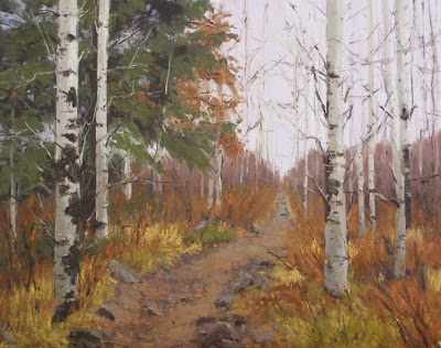
So, here's a picture of the OLD 16x20":

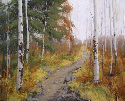
And here's the NEW 24x30":

I prefer the new one, just because I think it's painted better (a year makes a difference!), which is what I would hope for. I also think I achieved my goal of giving the composition more room to breathe, and painting the branches of the aspen trees so that they have a more lyrical quality and aren't so stilted. Nate says he still likes the old one better, but we don't actually have it around to compare, so who knows!!

Hi Stacey - saw you on Tracy Helgeson's blog, and thought I'd see what you're doing. I love what you've done with the light in this painting! Just wonderful.
ReplyDeleteI know a number of oil painters who begin with acrylic for the same reason - speed. And then the oil makes the image pop. Great to see your process.
ReplyDeleteHi Stacey!
ReplyDeleteWow, what a great step-by-step demo! Thanks for taking the time! It's so interesting to me to see how other artists work.
Besides, your landscapes have such a wonderful airy-fresh feeling about them; I wonder if it's the acrylics that helps to keep them from being heavy feeling? (Though I don't know if I ever seen one of your pieces live and in person.)
Say, for these big ones, do you categorize them as oil paintings or mixed media?
Hi Martha - thanks for stopping by!!
ReplyDeleteVeronica - good to hear that I'm not the only one who does this with the acrylics! Sometimes people act like it's really odd...
Tracy - honestly, my paintings looks about the same whether I use acrylics or oils as the underpainting since I typically cover up 95% of the acrylic paint by the time I'm done. Since the final surface is pretty much oil, I just classify them as oils.
My wife and I just bought this piece yesterday while we were on vacation in Winter Park. We love it. We also bought another piece, September Grove. As the boys here at the beach in Southern California say..."They're SO epic." Thank you, Stacey. You do amazing work.
ReplyDeleteColonel - thanks so much for buying these pieces. I'm so glad you found my blog and commented - I always love to hear from the people who end up with my paintings!!! I checked out your blog and I'm still laughing, btw... I hope you and your wife enjoy the paintings =)
ReplyDeletestacey, i really enjoyed seeing your wip demo...i can see why you painted a larger version of this one...it has such appeal, i would love to walk down that path! i'm torn between which i like better, they both are great paintings, although (any maybe it's the photo), i like the warmer colors of the smaller one. but i have a preference for warmer over cooler palettes. but...the more open composition of the larger one really does let the painting breathe!
ReplyDelete