Saturday, December 20, 2008
Demo - Fall Aspens, Final
No real progress on this one - just wanted to post a better picture of the final painting than the one at the end of the demo. There should be less glare here.
Monday, December 15, 2008
Demo - Fall Aspens Part 2

Next, I start to work back into the dark knots on the trunk, giving them more shape and adding some darker twigs and branches.

At this point, the aspen foliage is a bit blocky and lacking in dimension, so I start to work back into it, starting by adding some more color to the darker areas, and defining the shape of the trees more accurately.

Next, I add some lighter values to the foliage to give it more dimension and light. At this point, I'm using more paint and using texture to give the leaves some visual interest up close.

The last major area that needs work is the grass in the foreground. As with the other areas, I work into the hillside with darker values first, then lighter values, trying to soften this area a bit so that it doesn't compete with the aspens for interest.

So, that's where I've left the painting at this point. Here are a few closeups (sorry for the glare):


I'd say the painting is about 97% done at this point. Looking at it now, I can see a few things that are bugging me - the lower right hand corner is undefined, and the strong diagonal of the grassy hill is leading the eye right down and out of the painting. There's some funkiness going on in the mid-left. I'll wait a few days and go back in to rework these areas, and I'll post a better final photo then.
Sunday, December 14, 2008
Demo - Fall Aspens Part I
I was working on a batch of underpaintings one day when it occured to me that I HATED the process of underpainting. So, I stopped doing it. Now I do my studio paintings wet-on-wet, with the exception of minor corrections at the end, and I'm loving the process of painting so much more!
So, I'm trying to get some paintings done for a few spring shows, and for this one I wanted to do something with bright fall aspens. I'm doing this painting on a 24x18" Ampersand gessobord, and using a palette of titanium white, cad yellow lemon, cad yellow light, cad orange, quinacridone red, perm alizarin crimson, burnt sienna, and ultramarine blue. To start, I sketch in my composition using a thinned mixture of alizarin, ultramarine, and white.

Once the drawing is done, I block in the yellow foliage of the aspens using paint thinned with mineral spirits. I like to get these in first in a painting like this so that the color is nice and clean from the start. At this point, I'm using a 1" hog bristle brush to keep things nice and basic.
Next, I start to block in the background around the aspens, still using fairly thin paint. I want to reserve thicker paint for later stages of the painting, and leave the background thin so it recedes.
I continue to work forward, using slightly thicker paint as I block in the foliage in the foreground. I'm mainly trying to put down major shapes, colors, and values at this point, still using the 1" brush.
Once the background is blocked in, I start to paint the aspen trunks, first indicating the placement of the dark knots. At this point I switch to a smaller (size 6 or 8) brush so that I can go a bit smaller with my brushstrokes.
Next, I start to paint the darker side of the aspen trunks, trying to make sure I have the values right in comparison to my background, and using different colors and values to indicate the curvature of the trunks. I work with flat bristle brushes (still the size 6-8), and use the side of the brush to block in some of the thinner branches.
Once the darker part of the trunks is complete, I go back in and paint the sunlit side of the aspens. I use a palette knife or small liner brush for the highlights on the background trunks and smaller twigs.
At this point the block-in is complete and I'm ready to start refining different areas of the painting.
This is a good point to stop, so I'll post the rest tomorrow!
Thursday, June 19, 2008
Demo - Enlarging a Painting PART II
Anyhow, once the block-in was done, I started to rework the painting in oil. At this point, I was using oil paint straight from the tube for the most part, using OMS and res-n-gel to thin the paint as needed. The first step was to put down the dark shadows of the pine tree:
I often work from back to front when I'm doing a large painting, but when I'm doing a more organic subject like this, I sort of go from dark to light and skip around the canvas a bit. So, once the dark shadows of the tree were down, I started to bring in the mid-tone greens on the pine branches and the general masses of the red tree behind it. I was blocking in major masses at this point, and wasn't too concerned with allowing the sky to show through the tree quite yet:
Next, the "solidity" of the pine tree was distracting me, so I decided to go ahead and paint in the main tone of the sky, working the sky color back into the edges of the trees, and adding some sky holes throughout the mass of the pine tree:
Now that the top half of the painting was taking shape, I started to work downward into the foreground vegetation, starting with the willows at the top of the hill:
Then moving on to the foreground grasses:
Next, I painted in the rocky trail, and started to refine the foreground a bit by adding some of the red twigs/bushes:
At this point, I decided it was time to paint in the aspen trunks before refining the foreground any more. When I paint aspen trees, I often paint everything around them before tackling their trunks. I don't really know why I do this, but I do know that if the painting is working around the trunks, it will only look better once I complete them. I usually paint the knots on the tree trunks first (dark to light convention), but in this case I decided to paint the light mass of the tree bark first:
Then I added in the knots on the trees, which are what really give aspen trees their character:
At this point, all of the main masses in the painting were complete, and I set it up on the mantle above the fireplace for a couple of days so that I could spot the problems before finishing it up. The uniformity of color of the red bushes in the foregound was really bugging me, and the rocks on the trail at the bottom of the panel were too black. I brought the painting back into the studio and did some rework on the trail itself, added some color to the rocks at the bottom of the painting, and brought some varying colors/values into the foreground grasses and bushes to add dimension:
I took a final photo of the painting at that point, and decided there was too much sky showing through the pine tree on the left and that it was a bit distracting. A bit of work to make the pine a more solid mass, and the painting was done:
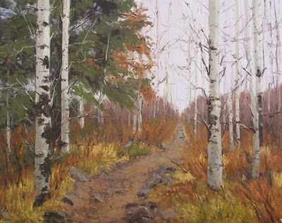
So, here's a picture of the OLD 16x20":
And here's the NEW 24x30":
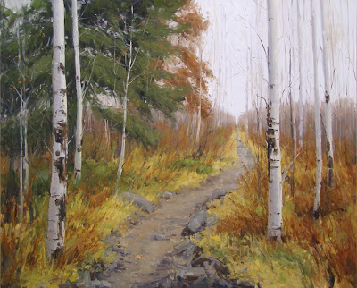
I prefer the new one, just because I think it's painted better (a year makes a difference!), which is what I would hope for. I also think I achieved my goal of giving the composition more room to breathe, and painting the branches of the aspen trees so that they have a more lyrical quality and aren't so stilted. Nate says he still likes the old one better, but we don't actually have it around to compare, so who knows!!
Wednesday, June 18, 2008
Demo - Enlarging a Painting PART I
I did the original painting about a year and a half ago, right after Aspen was born. Nate decided it was his favorite painting I'd ever done, so I kept it and it hung above our fireplace until about a month ago when a collector saw it on my website and got my gallery here in Winter Park to convince me to part with it. Here's the original 16x20" oil on canvas:

In the meantime, I had mentioned to the gallery that I wanted to paint the same scene on a larger scale and they had some interest, so I decided to go ahead with the larger painting. In enlarging this painting, I wanted to open up the composition a little bit to give the trees more room to breathe, and make the branches more lyrical.
I started with a loose sketch on 24x30" gessobord - nothing too detailed, since the subject is fairly organic and I'm wanting the painting to stay loose:
Next step was to start the block-in. I used a thin acrylic wash to start this one, mainly because I wanted it to dry quickly to I could start working over it with thicker oil paint the same day. One of the main reasons I do a block in with thinned paint is to eyeball the composition, and I like it to be dry before I continue so that I can fix any issues without having to fight wet paint underneath. Anyhow, in this case I started with the darkest darks:
Next, I blocked in the midtones in the pine tree and foregound grasses, keeping things simple and loose:
Then I painted in the trail and the lighter grasses in the foreground:
Once the foreground was in, I blocked in the sky, indicating where the sky holes would be in the pine tree to give it more shape and dimension. At this point, I was just trying to get things in the right place. I wasn't super concerned with my color and value being right on, especially since I was working with cheap acrylics!!
Finally, I blocked in the aspen trunks, indicating their main shape without doing much modeling, and locating where most of the knots would be. In reality, these trees had people's initials carved into them all over the place. I could actually read the name "RON" on one of the trees in my reference photo, but I obviously decided to ignore it in the name of artistic license!
So, at that point, the block-in was finished and I was ready to start refining things in oil. And that's where I'm going to break for now - the painting's done, but "So You Think You Can Dance" is over (I'm SOOO addicted to that show) and it's my bedtime, so I'll continue tomorrow.
Oh, and sorry about the shadow from my easel at the top of the painting in all of these photos. That's what I get for having my studio lights almost directly above my head...
Thursday, December 13, 2007
Downsizing
As I was working on a couple of these smaller paintings, I took some progress shots just to prove that I'm not always as analytical and methodical about my painting process as I am when I work large.
This first study is a 10x8" of some aspens in the fall. First step is a rough sketch in thinned paint. This study is mostly about color, so I'm not too concerned with the drawing.
Next I block in the general area of the yellow aspen leaves. This is probably the only time I'll ever paint something other than the sky first! I just did this to make sure my yellow stays nice and clean.
Next, I block in the sky with thinned paint.
Then, the rest of the foreground.
About an hour and I'm finished. This is just a study to see if it's a subject I might want to do slightly larger, so I won't do any more work on this one. I think it might work better in a slightly taller format so that I can exaggerate the height of the taller tree - maybe a 16x12"?
Tuesday, December 11, 2007
Large Landscape Demo - DONE (for now...)

I wanted to put this painting in the Governor's Art Show in the spring and use the image in the catalog, but I'm not sure it's good enough. I might still keep it for the show (I can have two large and two small paintings in the show), but I just don't know if I want it in the catalog. The painting in the catalog needs to be eye-catching, and I'm so tired of this painting that I'm not sure whether it is or not. Decisions...
Now I'm going to hide this somewhere so I don't have to look at it, and get to work on some small paintings. An 8x10" is going to seem like nothing after slaving away at this thing all week!
Monday, December 10, 2007
Large Landscape Demo - PART INFINITY
Oh well, that'll be tomorrow. For now, more progress shots of the neverending landscape painting!
For starters, I finally got around to blocking in the trees and dark accents on the hillside. I was having a hard time judging the composition without those trees there.
Next I work some different colors and values into the trees, paint the grass and bushes on the foreground hillside, and add in the rocks that are out in the lake.
At this point, things aren't quite right. The light on the mountain just isn't "popping" like I'd like it to, and there is no center of interest as a result. Sometimes at this stage, I like to detach myself from the "what" that I'm painting, and just work on the forms and composition - the best way to do this is to turn the painting upside down. I actually can't remember the last time I did this with a landscape, but I used to do it all the time when I was painting portraits. It helps me to stop thinking about what I think things should look like. So here it is upside down.
Looking at it upside down, it's clear that there isn't enough contrast on the middle part of the mountain, and that there isn't quite enough detail on the shaded part of the mountain. Also, the rocks on the hillside below the mountain are too fragmented - they need to be simplified. So, keeping it upside down, I go to work on refining these areas, trying to give the mountains a bit more punch.
Turning it right side up again, I'm happier with the contrast on the mountain and the way things read.
Then again, I'm not loving those rocks out in the middle of the lake. I decide to see what things look like without them, and then I stop for the day.
I'm almost done, but I really don't like the rocks along the top of the foreground hillside - they seem to keep the eye down in the lower part of the painting, and I want the eye to travel up to the mountains. Looks like I might have to do some editing tomorrow.
Sunday, December 09, 2007
Large Landscape Demo - PART IV
When I stopped on Friday, I had pretty much finished the mountain and hillside, so I was ready to start on the water today. The first step was to block in the main shape of dark color, so that I could work reflections down into it.
Once I had the main color/value blocked in, I started to go in and add reflections. I probably repainted this section three times before I finally decided to scrape it and start over. At the OPA show this spring, Quang Ho was doing a demo and scraped the entire eye off of the portrait after painting it in - as he scraped it he quipped that you "gotta practice non-attachment," and, "you won't learn and grow if you get attached." At this point, I had been painting for about two hours, so it was hard to scrape what I had done and start over, but that's what had to be done. This picture is right after I had scraped everything. Sorry I didn't take a picture of what it looked like before I scraped - rest assured that it wasn't working!
This time I decided to keep things simple and loose, and just barely indicate reflections where necessary so that the water wouldn't be the center of attention. I got the water to a point that I felt was working, and then went back in and fixed the shoreline, which I had previously painted too light and too prominent.
Looking at the photo above, I think that the ripples across the surface of the top of the lake are a bit too bright, and might need to be toned down a bit. They don't jump out that much in real life, but sometimes the camera points out things that need to be fixed, and I think this is one of them.
Moving on, I started to block in some of the grass and the shape of the rocks on the foreground hillside.
Before finishing for the day, I blocked in a midvalue as a base for the foregound rocks. I've only just started on the grasses, and haven't touched the trees, so things look a bit weird.
I'm hoping to finish this tomorrow. I need to refine the foreground rocks, finish the grass on the hillside, and paint the pine trees and some rocks that are out in the lake. There are also some spots on the mountain and hillside that need correcting once I'm done with everything else, and I'll probably do some work on the water too.
Today was one of those days where I managed a good 4-5 hours in the studio, and feel like the outcome only looks like an hour or so of work. I'm still not 100% happy with the water, but it's salvageable at this point. All in all a sort of frustrating day, but at least I'm set up to move on tomorrow.
